


Let's Explore Flexbox.
What is Flexbox ?
Flexbox is a layout mechanism designed for laying out groups of items in one dimension. It was designed to provide a way to lay out, align and distribute space to items in a container even when their size is unknown or dynamic.
The main idea behind the flex layout is to give the container the ability to alter its item's width/height and order to best fill the available space to better support all kinds of screen sizes. A flex container automatically expands items to fill available free space or shrinks them to prevent overflow.
The flex layout is direction-agnostic unlike the regular layouts such as block which is vertically aligned and inline which is horizontally aligned. While those work well for simple pages, they lack the flexibility to support complex layouts especially when it comes to orientation changing, resizing, stretching, shrinking, etc...
When we say flexbox is one dimensional it means flexbox only deals with one dimension at a time either as a row or column. And That row or column is defined using the flex-direction property.
Understanding The flex-direction And Two Axes of Flexbox
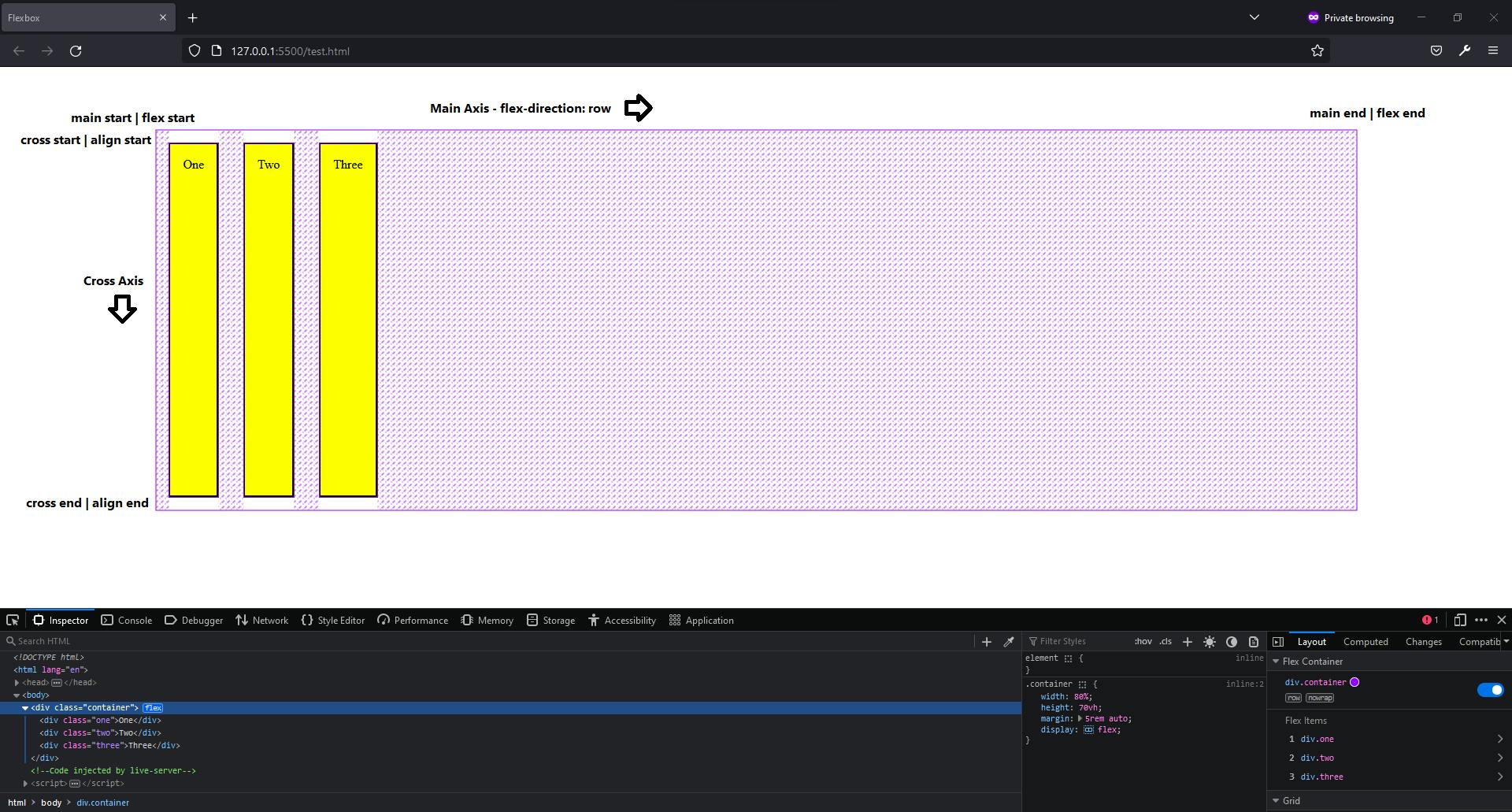
When working with flexbox we need to think in terms of two axes the main axis and the cross axis.
The main axis is set by the
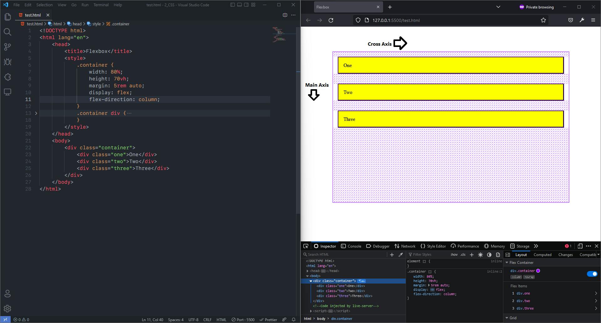
flex-directionproperty. If it isrowthen our main axis is along the row and the cross axis is along the column.And if it is
columnthen the main axis is along the column and the cross axis is along the row.By default flex-direction is row.
Flex items move as a group on the main axis. Let's look at some example.
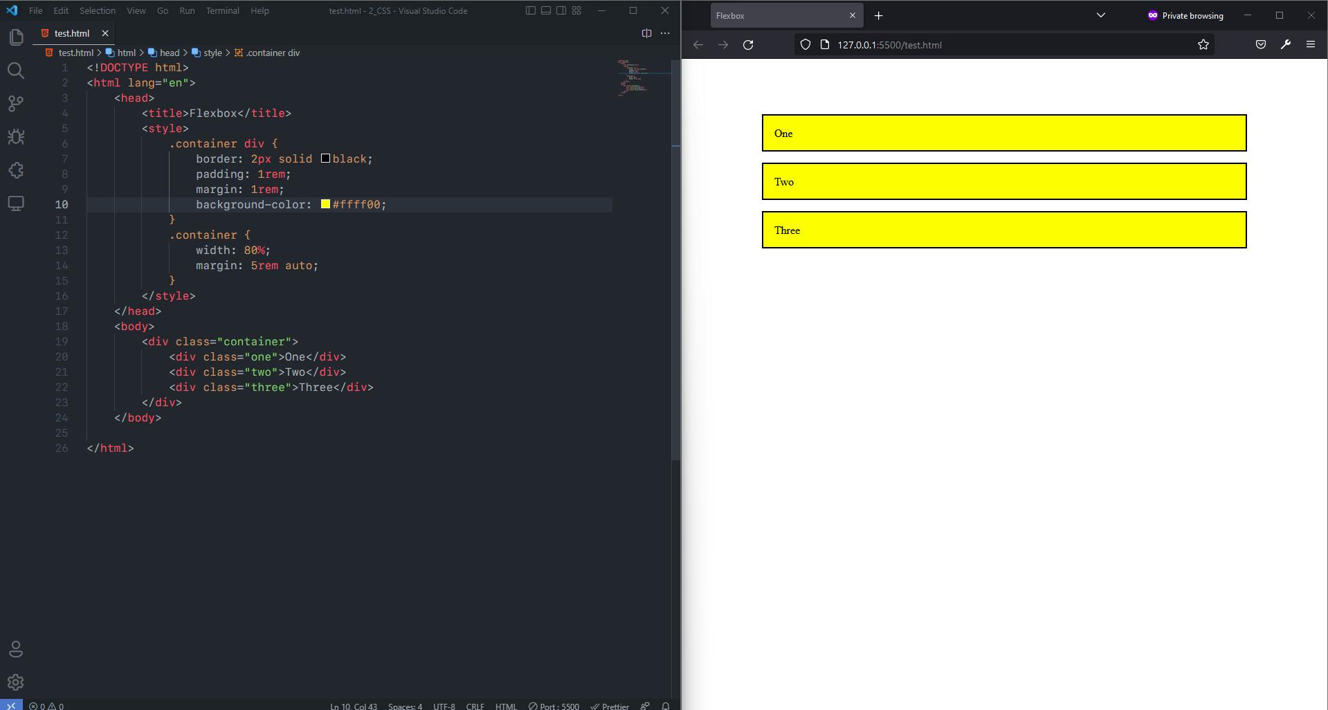
E.g., Before Applying Flexbox
Code:
<!DOCTYPE html>
<html lang="en">
    <head>
        <title>Flexbox</title>
        <style>
            .container {
                width: 80%;
                height: 70vh;
                margin: 5rem auto;
            }
            .container div {
                border: 2px solid black;
                padding: 1rem;
                margin: 1rem;
                background-color: #ffff00;
            }
        </style>
    </head>
    <body>
        <div class="container">
            <div class="one">One</div>
            <div class="two">Two</div>
            <div class="three">Three</div>
        </div>
    </body>
</html>
Output:
After Applying Flexbox with default flex direction which is row
Code:
<!DOCTYPE html>
<html lang="en">
    <head>
        <title>Flexbox</title>
        <style>
            .container {
                width: 80%;
                height: 70vh;
                margin: 5rem auto;
                display: flex;
            }
            .container div {
                border: 2px solid black;
                padding: 1rem;
                margin: 1rem;
                background-color: #ffff00;
            }
        </style>
    </head>
    <body>
        <div class="container">
            <div class="one">One</div>
            <div class="two">Two</div>
            <div class="three">Three</div>
        </div>
    </body>
</html>
Output:
After Changing flex direction from row to column Code:
<!DOCTYPE html>
<html lang="en">
    <head>
        <title>Flexbox</title>
        <style>
            .container {
                width: 80%;
                height: 70vh;
                margin: 5rem auto;
                display: flex;
                flex-direction: column;
            }
            .container div {
                border: 2px solid black;
                padding: 1rem;
                margin: 1rem;
                background-color: #ffff00;
            }
        </style>
    </head>
    <body>
        <div class="container">
            <div class="one">One</div>
            <div class="two">Two</div>
            <div class="three">Three</div>
        </div>
    </body>
</html>
Output:
- There are two more
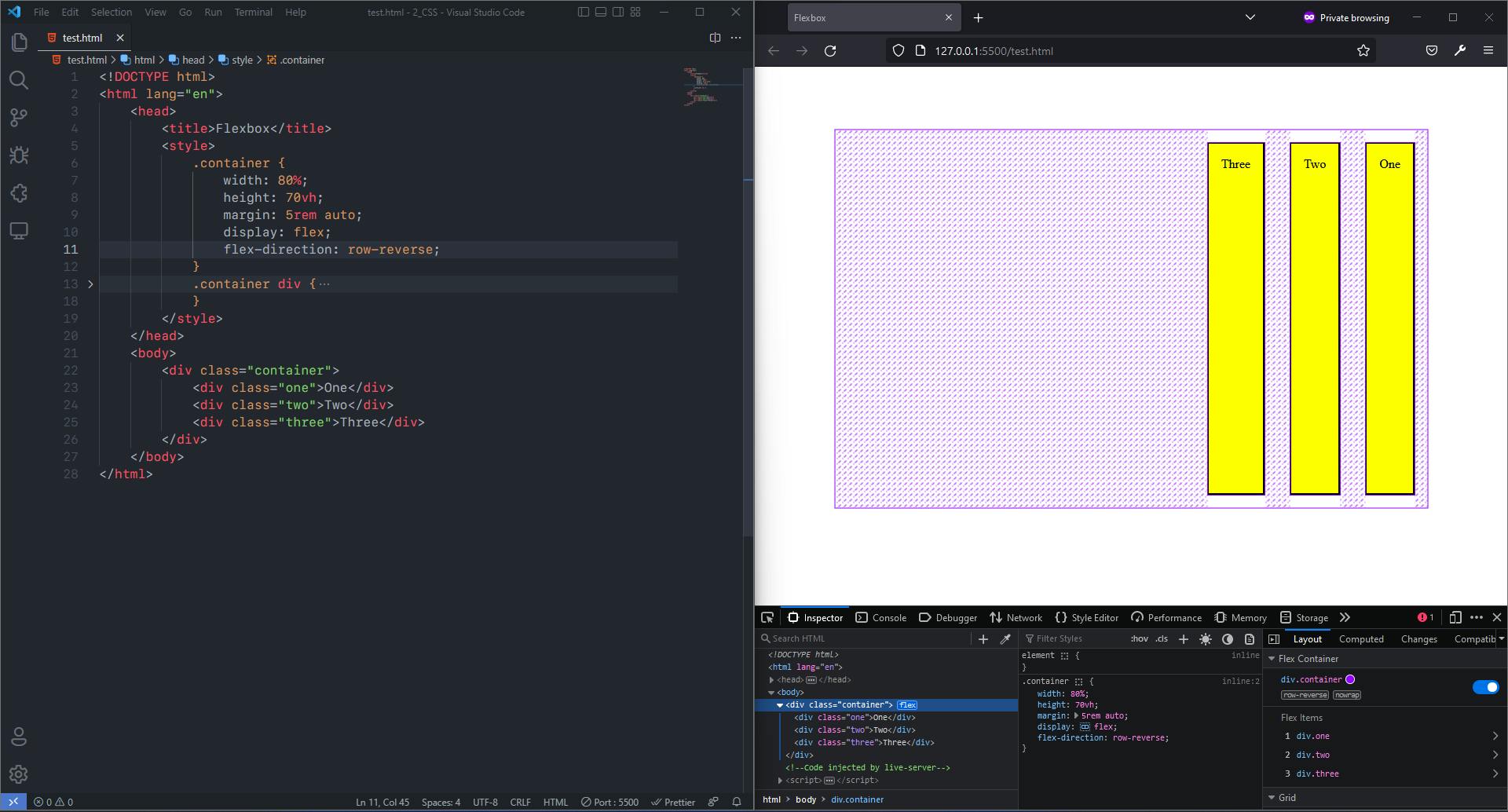
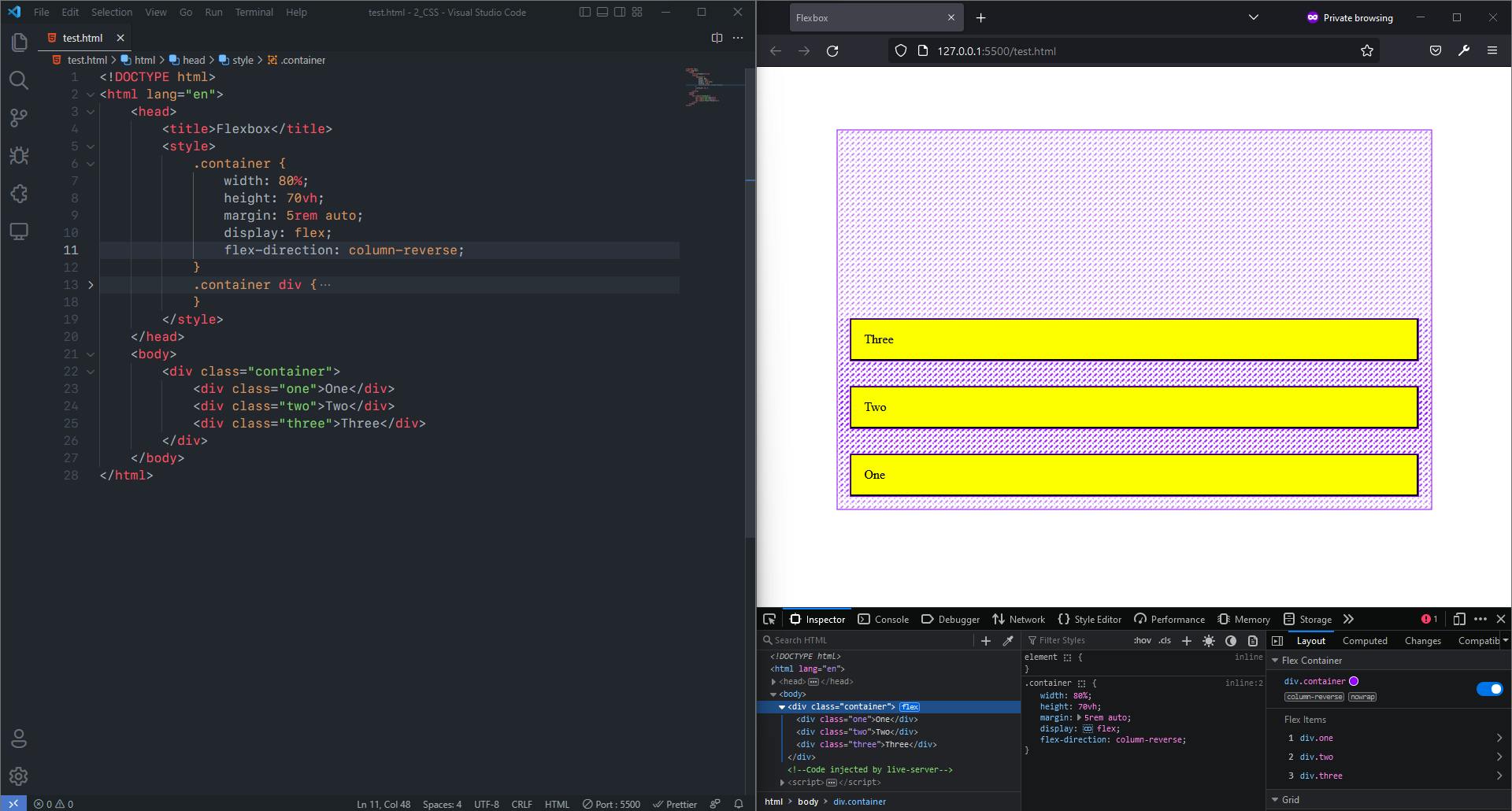
flex-directionproperties that are in the flexboxrow-reverseandcolumn-reverseboth have both have same axis position but they are in reverse. In case of row instead of being left to right it becomes right to left and for column instead of top to bottom it becomes bottom to up.
E.g., flex-direction: row-reverse
E.g., flex-direction: column-reverse
As seen in above examples the items inside flexbox called flex items do not go beyond the area of the flex container. And This flex container gives us access to many properties with which we can manipulate the flex items as well as the flex container it self.
We can Divide The Properties of the flexbox in two sections:
- Properties for the Parent or Flex Container
- Properties for The Children or Flex Items
1. Flex Properties For The Parent
display: This property defines flex container and enables the flex context for all its children. As shown in above examples. Syntax:.container { display: flex; }flex-direction: This property defines the main axis or the direction in which the flex items are laid out. Because as discussed above flexbox is a 1D layout model. As shown in examples above. The main 4 values offlex-directionare:row: It is the default value. It flows from left to right horizontally. The main axis is along the Row.row-reverse: It flows from right to left horizontally that is in opposite direction torow. Same asrowthe main axis along the Row.column: It flows from top to bottom vertically. The main axis is along the Column.column-reverse: It flows from bottom to top vertically. Same ascolumnmain axis along the Column.
Syntax:
  .container {
    flex-direction: row | row-reverse | column | column-reverse;
  }
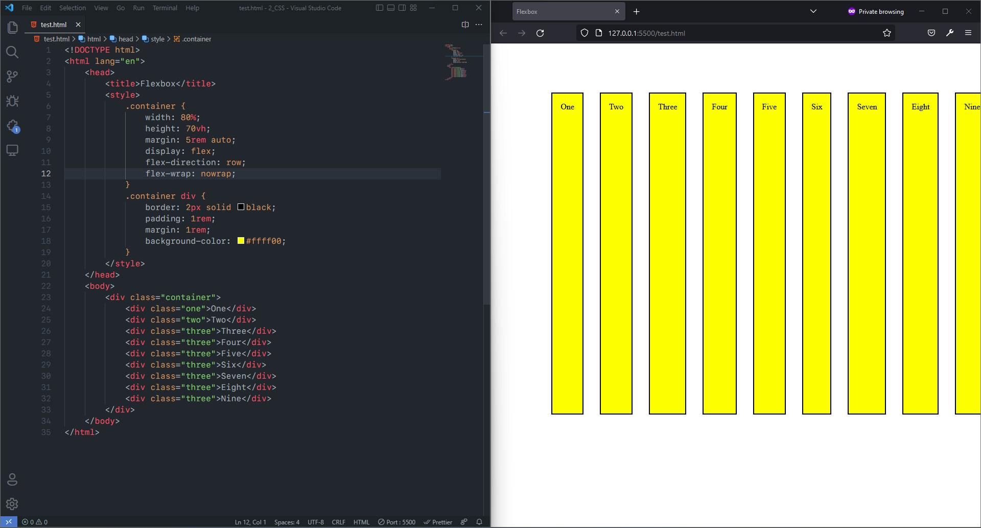
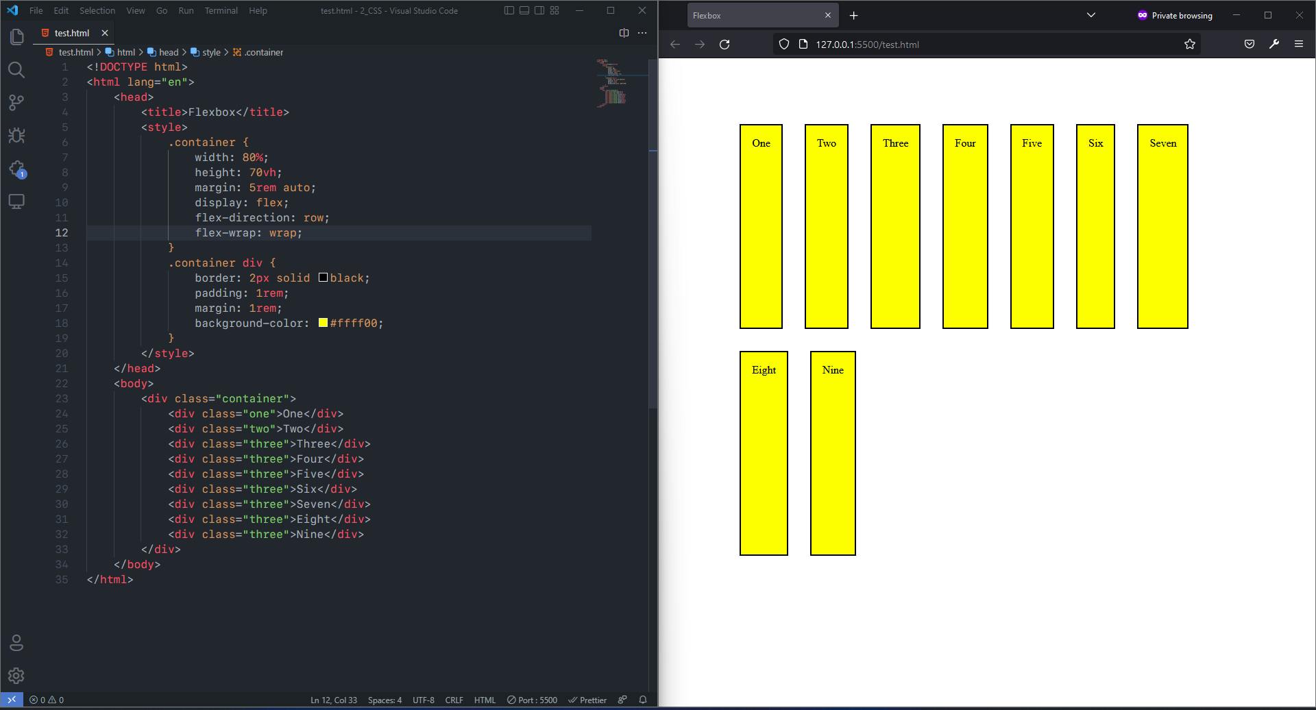
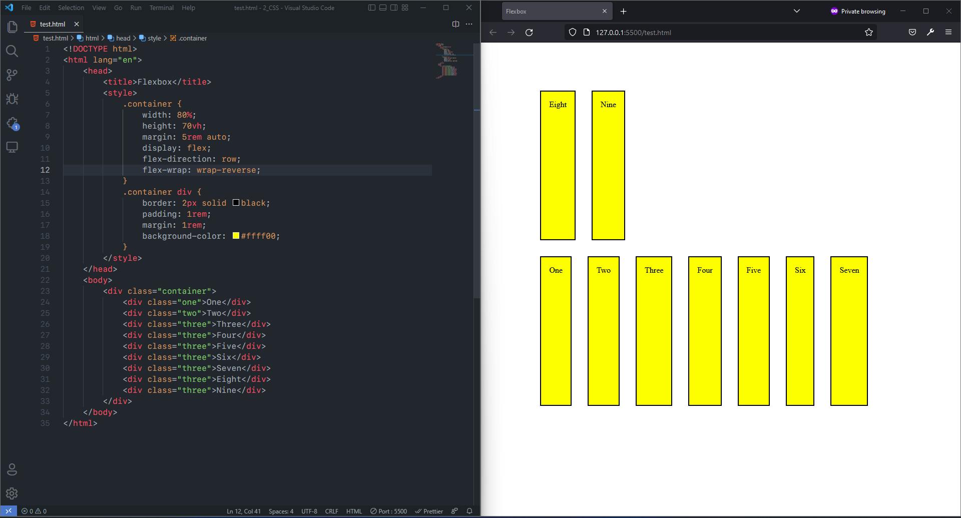
flex-wrap: By default all the flex items will try to fit into one row. That can be changed so that items can wrap as needed with this property. The 3 main values offlex-wrapare:nowrap: It is the default value. It will force all flex items on one line.wrap: It move the overflowing flex items onto the next line. That is it will move the flex items onto next line when total width of flex items in a row is more than width of the container. And It will wrap in direction from top to bottom. That is the flex item will move to new line on the bottom of current line.wrap-reverse: Similar aswrapbut items will wrap in direction from bottom to top. That is flex items will move onto new line above the current line.
Syntax:
  .container {
      flex-wrap: nowrap | wrap | wrap-reverse;
  }
E.g.: nowrap
Code:
  <!DOCTYPE html>
  <html lang="en">
      <head>
          <title>Flexbox</title>
          <style>
              .container {
                  width: 80%;
                  height: 70vh;
                  margin: 5rem auto;
                  display: flex;
                  flex-direction: row;
                  flex-wrap: nowrap;
              }
              .container div {
                  border: 2px solid black;
                  padding: 1rem;
                  margin: 1rem;
                  background-color: #ffff00;
              }
          </style>
      </head>
      <body>
          <div class="container">
              <div class="one">One</div>
              <div class="two">Two</div>
              <div class="three">Three</div>
              <div class="three">Four</div>
              <div class="three">Five</div>
              <div class="three">Six</div>
              <div class="three">Seven</div>
              <div class="three">Eight</div>
              <div class="three">Nine</div>
          </div>
      </body>
  </html>
Output:
E.g.: wrap
Code:
  <!DOCTYPE html>
  <html lang="en">
      <head>
          <title>Flexbox</title>
          <style>
              .container {
                  width: 80%;
                  height: 70vh;
                  margin: 5rem auto;
                  display: flex;
                  flex-direction: row;
                  flex-wrap: wrap;
              }
              .container div {
                  border: 2px solid black;
                  padding: 1rem;
                  margin: 1rem;
                  background-color: #ffff00;
              }
          </style>
      </head>
      <body>
          <div class="container">
              <div class="one">One</div>
              <div class="two">Two</div>
              <div class="three">Three</div>
              <div class="three">Four</div>
              <div class="three">Five</div>
              <div class="three">Six</div>
              <div class="three">Seven</div>
              <div class="three">Eight</div>
              <div class="three">Nine</div>
          </div>
      </body>
  </html>
Output:
E.g.: wrap-reverse
Code:
  <!DOCTYPE html>
  <html lang="en">
      <head>
          <title>Flexbox</title>
          <style>
              .container {
                  width: 80%;
                  height: 70vh;
                  margin: 5rem auto;
                  display: flex;
                  flex-direction: row;
                  flex-wrap: wrap-reverse;
              }
              .container div {
                  border: 2px solid black;
                  padding: 1rem;
                  margin: 1rem;
                  background-color: #ffff00;
              }
          </style>
      </head>
      <body>
          <div class="container">
              <div class="one">One</div>
              <div class="two">Two</div>
              <div class="three">Three</div>
              <div class="three">Four</div>
              <div class="three">Five</div>
              <div class="three">Six</div>
              <div class="three">Seven</div>
              <div class="three">Eight</div>
              <div class="three">Nine</div>
          </div>
      </body>
  </html>
Output:
flex-flow: This is a shorthand for the flex-direction and flex-wrap properties, which together define the flex container’s main and cross axes. The default values arerowandnowrap.
Syntax:
  .container {
      flex-flow: < row | column > < nowrap | wrap | wrap-reverse > ;
  }
justify-content: It defines how the browser distributes space between and around content items along the main-axis of a flex container. It also exerts some control over the alignment of items when they overflow the line. It has many values, some are supported by majority of browsers and some are not.
Syntax:
  .container {
    justify-content: < flex-start | flex-end | center | space-between | space-around | space-evenly | start | end | left | right >;
  }
The values supported by majority of browsers are:
flex-start: It is the default value. Flex items are positioned towards the start of the flex-direction. E.g.,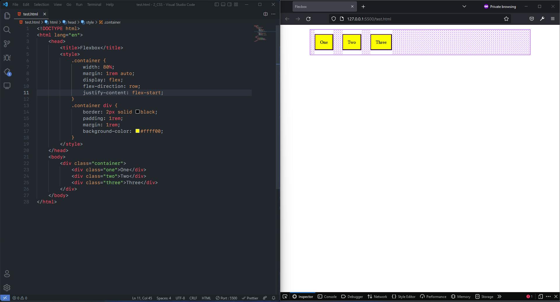
flex-end: Flex items are positioned towards the end of the flex-direction. E.g.,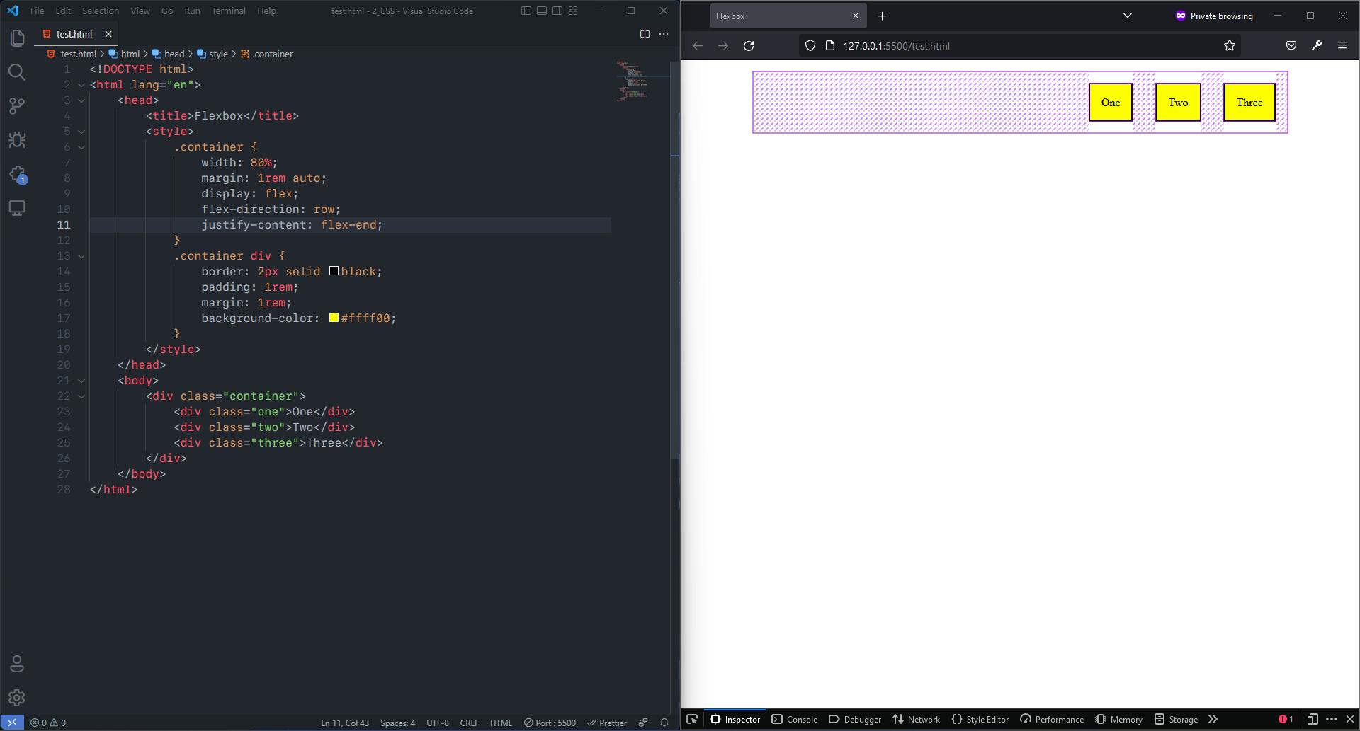
center: Flex items are centered along the line. E.g.,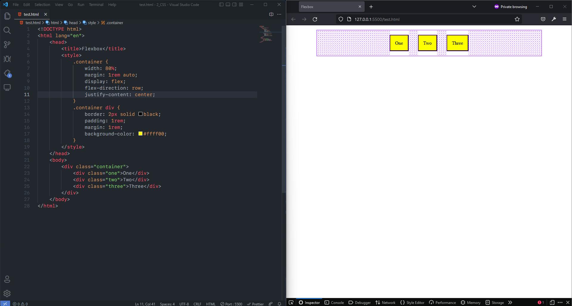
space-between: Flex items are evenly distributed in the line; first item is on the start line, last item is on the end line. E.g.,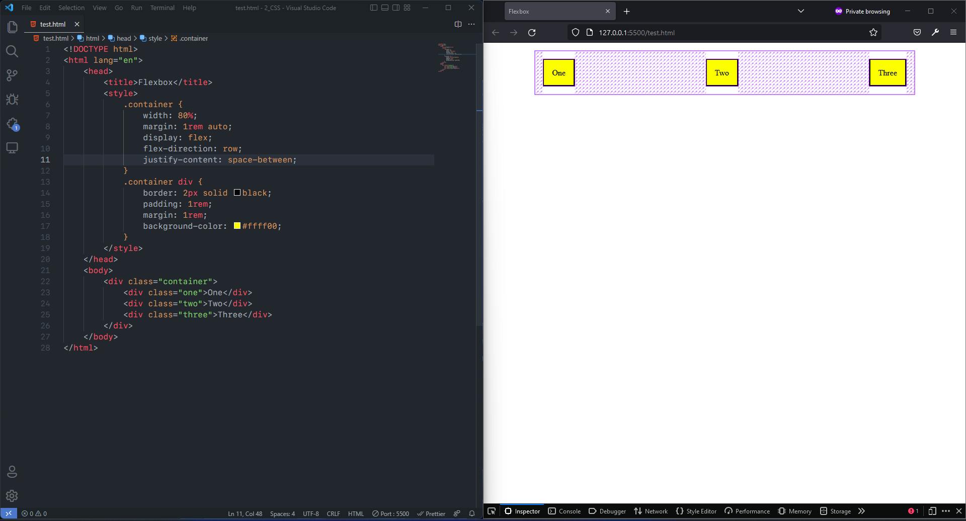
space-around: Flex items are evenly distributed in the line with equal space around them. E.g.,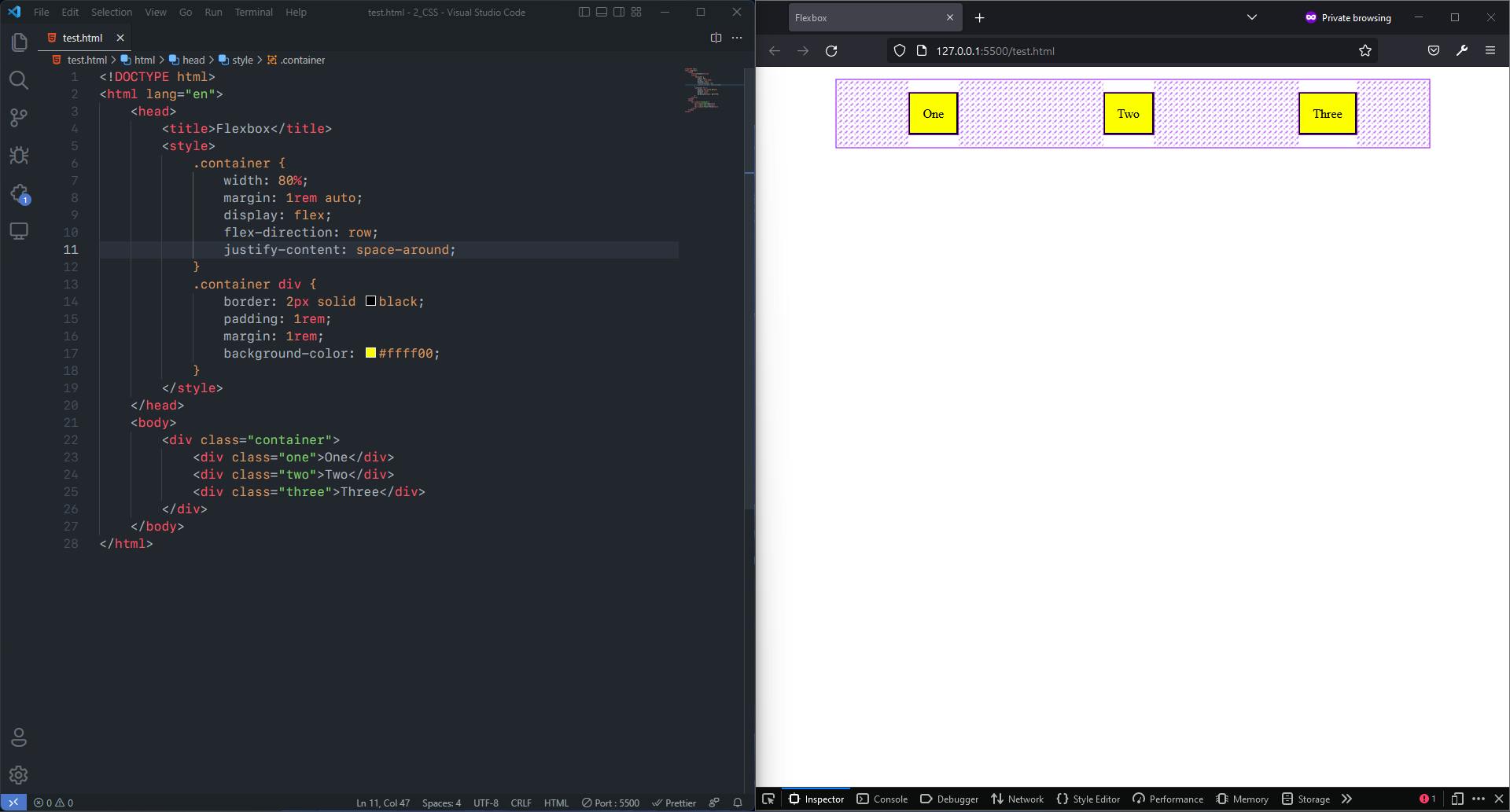
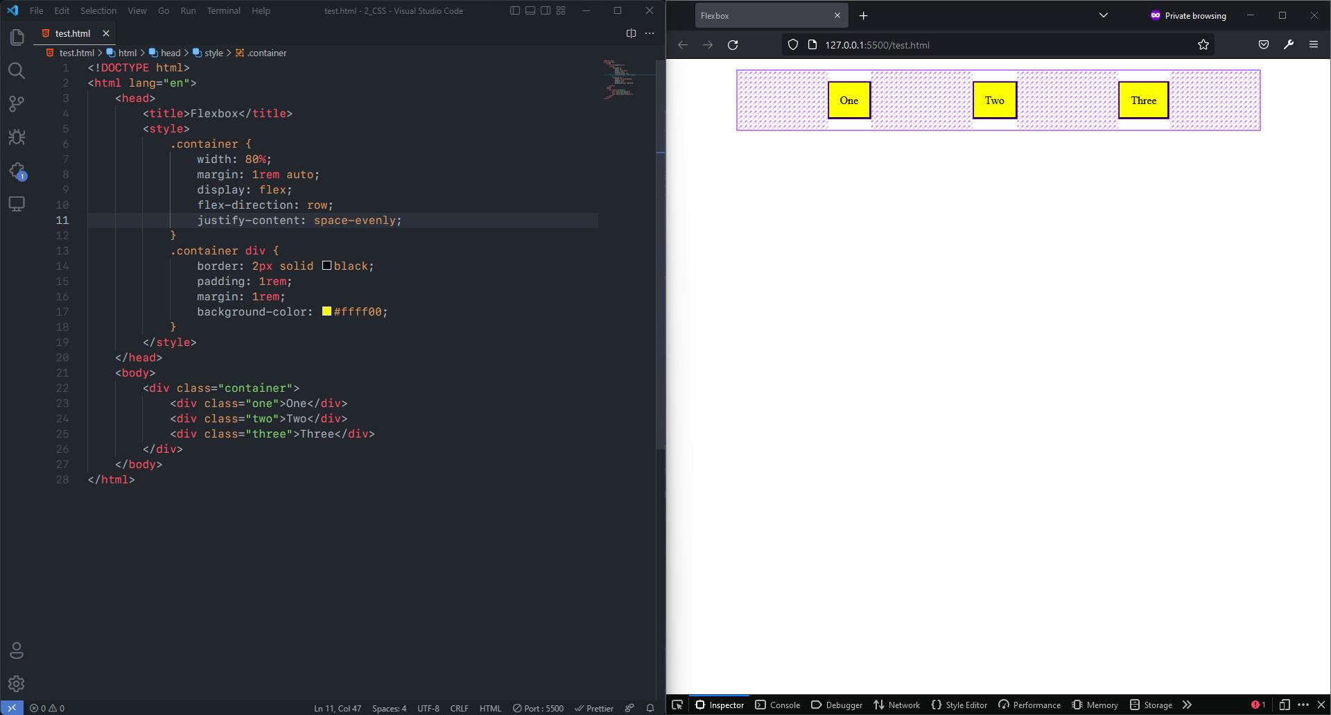
space-evenly: Flex items are distributed so that the spacing between any two items (and the edges) is equal. E.g.,
align-items: This defines the default behaviour for how flex items are laid out along the cross axis on the current line. Think of it as the justify-content version for the cross-axis (perpendicular to the main-axis). It also has some values that are supported and some that values that are not supported.
Syntax:
```css
.container {
  align-items: stretch | flex-start | flex-end | center | baseline;
}
```
The Supported Values Are:
stretch: It is the default value. It stretches the flex item to fill the container (still respect min-width/max-width). E.g.,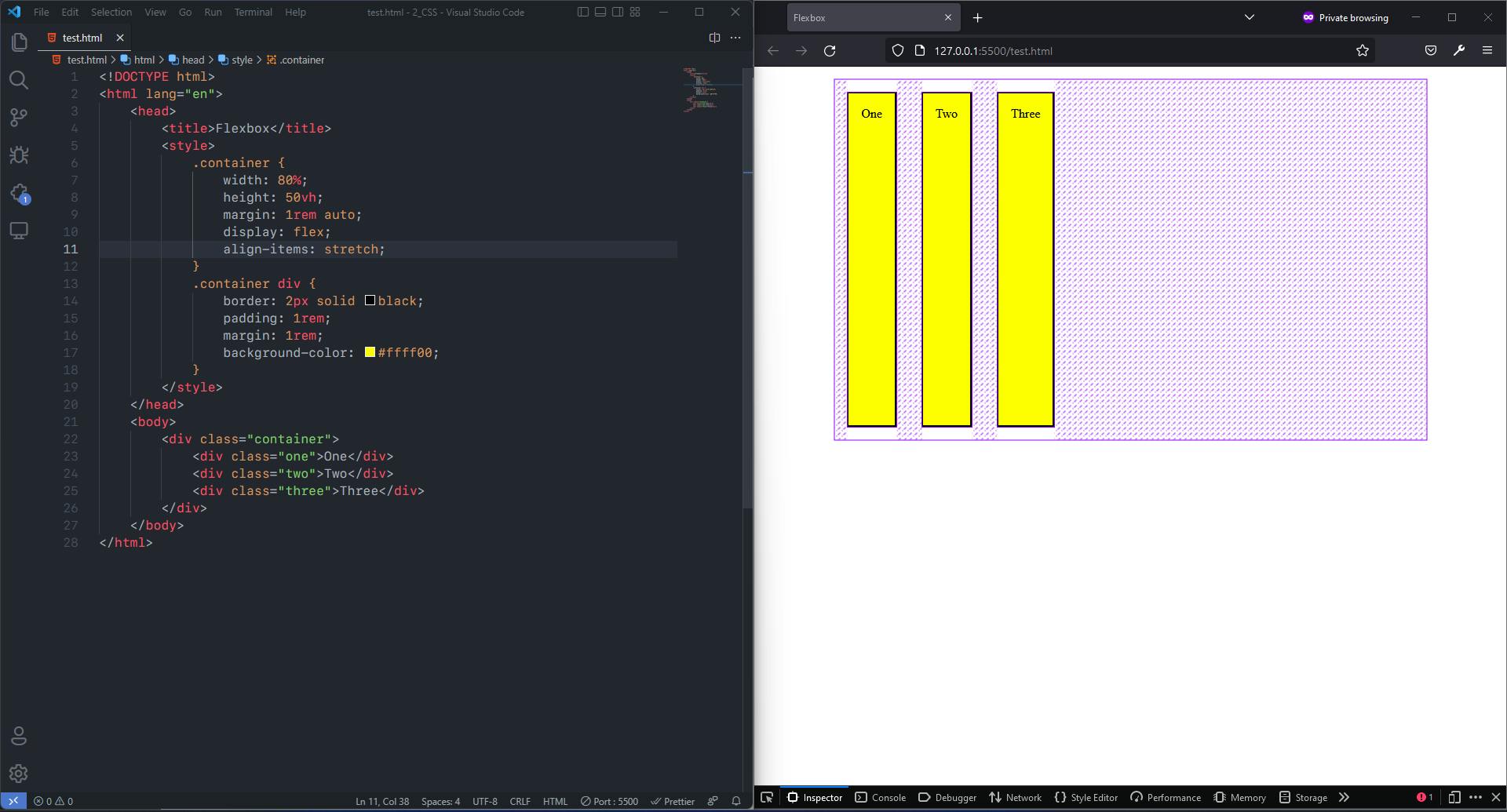
flex-start: Flex items are placed at the start of the cross axis. E.g.,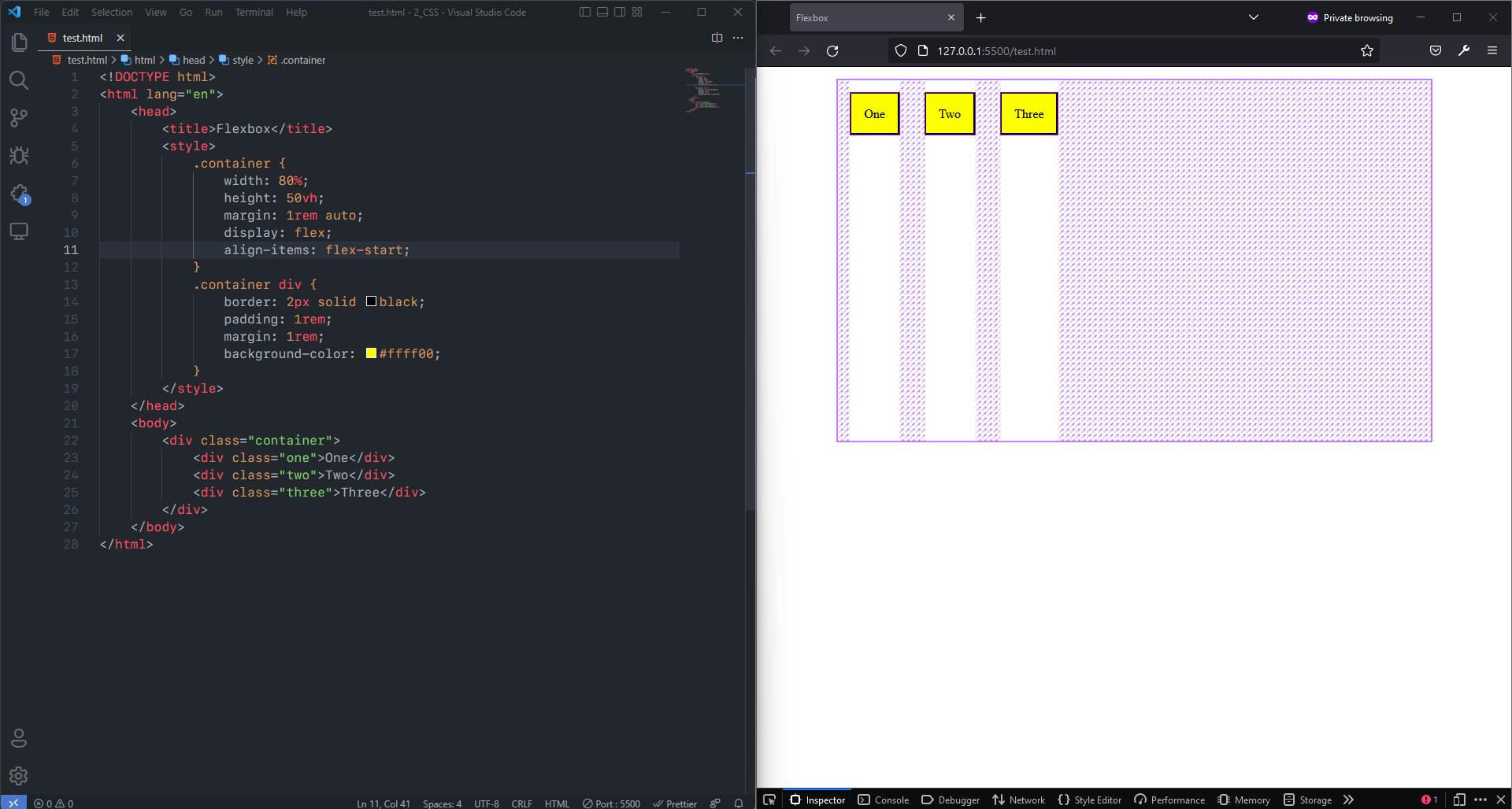
flex-end: Flex items are placed at the end of the cross axis. E.g.,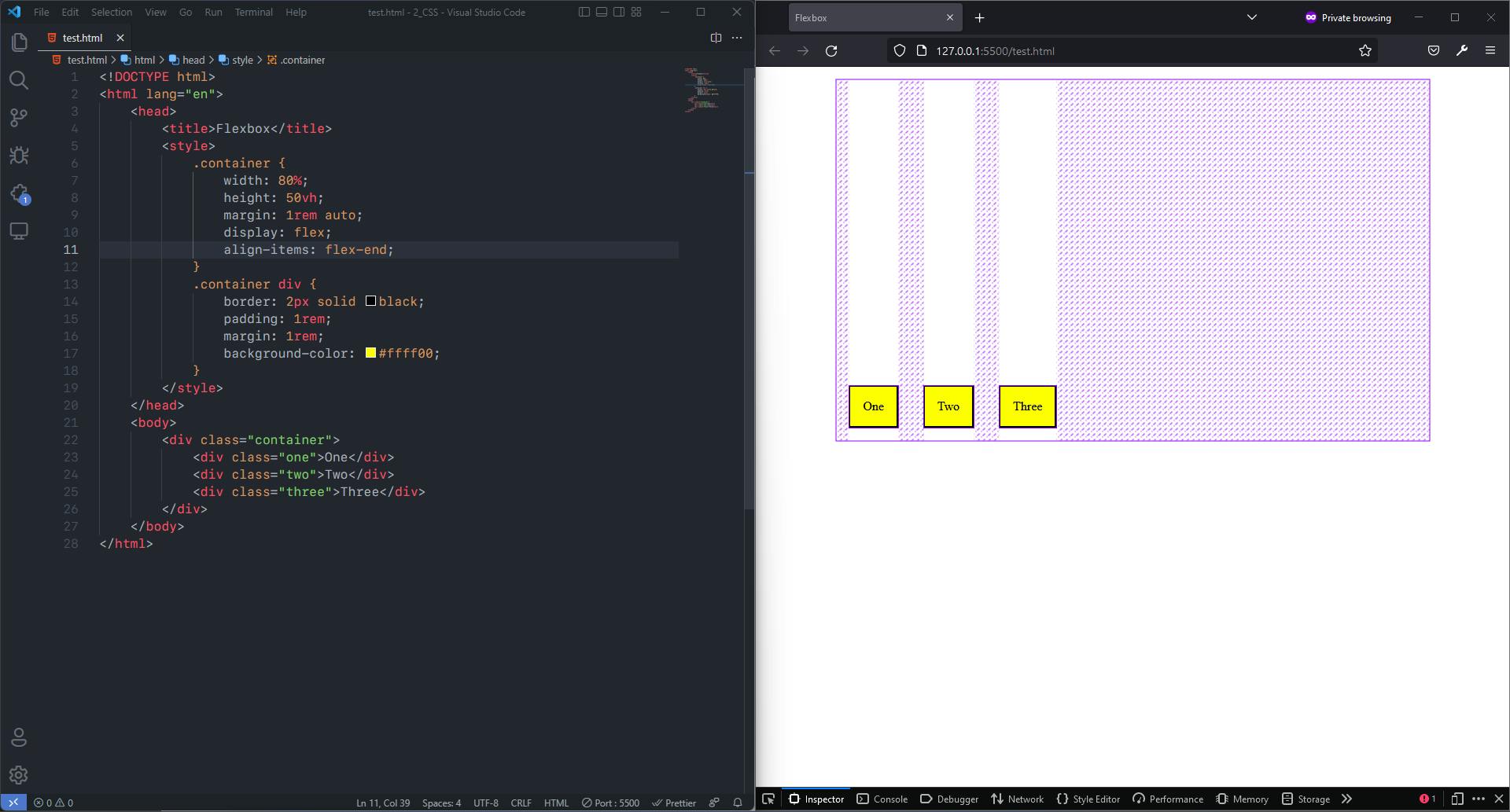
center: Flex items are centered in the cross-axis. E.g.,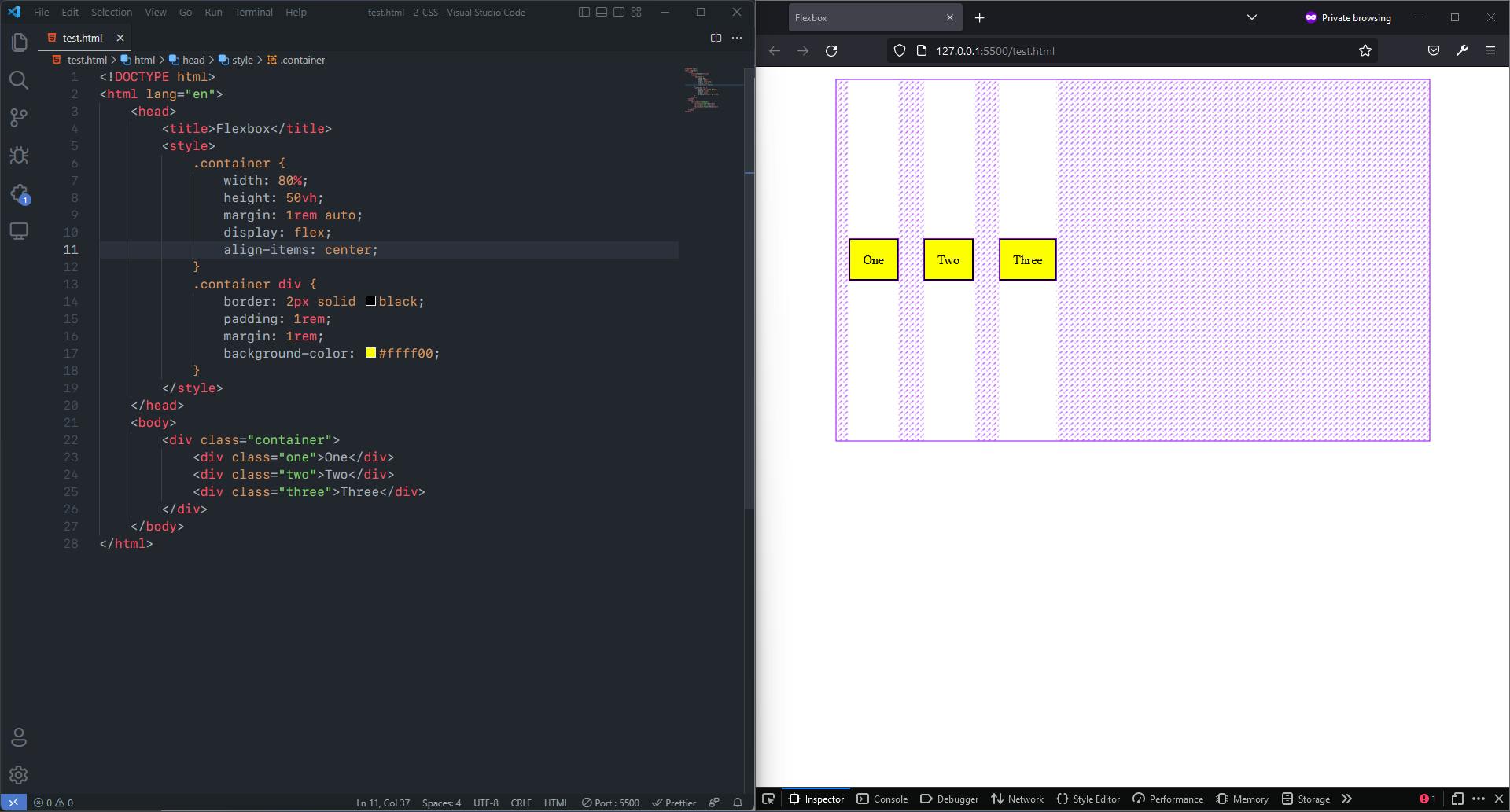
align-content: This aligns a flex container’s lines within when there is extra space in the cross-axis, similar to how justify-content aligns individual items within the main-axis. It also has some values that are supported and some are not.
Syntax:
    .container {
      align-content: flex-start | flex-end | center | space-between | space-around | space-evenly | stretch;
    }
The Supported Values are:
flex-start: Flex items packed to the start of the container.flex-end: Flex items packed to the end of the container.center: Flex items centered in the containerspace-between: Flex items evenly distributed; the first line is at the start of the container while the last one is at the end.space-around: Flex items evenly distributed with equal space around each line.space-evenly: Flex items are evenly distributed with equal space around them.stretch: Flex items stretch to take up the remaining space. It is the default value.
E.g., %[codepen.io/TheHonouredDev/embed/qBKLmdj]
So Why There is no justify-self in Flexbox ?
Flex items act as a group on the main axis. So there is no concept of splitting an individual item out of that group.
Flexbox works very nicely with auto margins. If you come across a need to split off one item from a group, or separate the group into two groups you can apply a margin to do this.
gap, row-gap, column-gap: The gap property explicitly controls the space between flex items. It applies that spacing only between items and not on the outer edges.
Syntax:
  .container {
    gap: < value in rem/px/vw/vh/em/percentage >;
  }
2. Flex Properties For The Child
order: By default, flex items are laid out in the source order. However, the order property controls the order in which they appear in the flex container. Items with the same order revert to source order.
Syntax:
  .item {
  order: 2; /* default is 0 */
  }
flex-grow: It defines the ability for a flex item to grow if necessary. It accepts a unitless value that serves as a proportion. all items have flex-grow set to 1, the remaining space in the container will be distributed equally to all children. Negative numbers are invalid.
Syntax:
  .item {
  flex-grow: 2; /* default 0 */
  }
flex-shrink: It defines the ability for a flex item to shrink if necessary. Negative numbers are invalid.
Syntax:
  .item {
  flex-shrink: 4; /* default 1 */
  }
flex-basis: It defines the default size of an element before the remaining space is distributed. If set to 0, the extra space around content isn’t factored in. If set to auto, the extra space is distributed based on its flex-grow value.
Syntax:
  .item {
  flex-basis: < integer > | auto; /* default auto */
  }
flex: shorthand for flex-grow, flex-shrink and flex-basis combined. The second and third parameters (flex-shrink and flex-basis) are optional. The default is 0 1 auto.- It is recommended that you use this shorthand property rather than set the individual properties. The shorthand sets the other values intelligently.
Syntax:
  .item {
  flex: none | [ <'flex-grow'> <'flex-shrink'>? || <'flex-basis'> ]
  }
Conclusion
Flexbox is one of best model for creating layouts right now and far more simpler and power than older methods. Once get familiarized with it creating responsive layouts for website becomes a far more simpler.