


Welcome, Welcome In This article we will talk about the CSS Box Model.
Everything displayed by CSS is a box. Understanding how the CSS Box Model works is therefore a core foundation of CSS. - From web.dev
Introduction
When laying out a webpage, the browser's user agent processes the html document tree for visual media according to the visual formatting model.
It represents each element in the document tree as zero or more rectangular boxes according to the standard CSS Box Model.
The Layout of these boxes is determined by:
- Box Dimensions(Margin, Padding, Border, Content Area) and Type(Inline, Block, Inline-Block, Table etc.)
- Positioning Scheme (Normal Flow Including Sticky/Relative Position, Float, Absolute/Fixed Position)
- Relationships Between Elements in The Document Tree.
- External Information (e.g. viewport size, intrinsic dimension of image, etc..)
Let's Look at the factors for determining layout for boxes of Box Model one by one.
1. Box Dimensions and Types
There are mainly four properties which determine dimension of a box they are laid out as shown in image below:
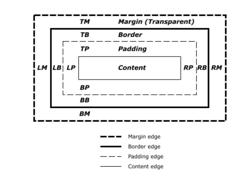
From The Image Above we can determine the main four properties are margin, border, padding, content.
Margin:
- Margin is the outer most layer. It is divided in four section top, right, bottom and left. And the property can be set individually for all four sides.
- Margin is applied to all elements except elements with table display types other than table-caption, table and inline-table.
- The margin properties specify colour and style of the margin area of a box
Border:
- Border is the second outer most layer. It is also divided in four section top, right, bottom and left. And the property can be set individually for all four sides.
- The border properties specify the width, colour, and style of the border area of a box. These properties apply to all elements.
- If the box-sizing property is set to border-box, the border area's size can be explicitly defined with the width, min-width, max-width, height, min-height, and max-height properties.
Padding:
- Padding is the Third Layer from outside. It is also divided in four section. And The Property can be set individually for all four sides.
- The padding properties specify the width of the padding area of a box.
- It applies to all elements except table-row-group, table-header-group, table-footer-group, table-row, table-column-group and table-column.
Content Area:
- The content area, bounded by the content edge, contains the "real" content of the element, such as text, an image, or a video player.
- Its dimensions are the content width (or content-box width) and the content height (or content-box height). It often has a background color or background image.
- If the box-sizing property is set to content-box (default) and if the element is a block element, the content area's size can be explicitly defined with the width, min-width, max-width, height, min-height, and max-height properties.
The type of the box also determines which property from above apply to it. if the box is of a block level element then all properties of above apply. But if the box is of a inline element then the height and width of the element can't be set. Inline element don't have top and bottom margin.
2. Positioning Scheme
A box may be laid out according to five positioning schemes:
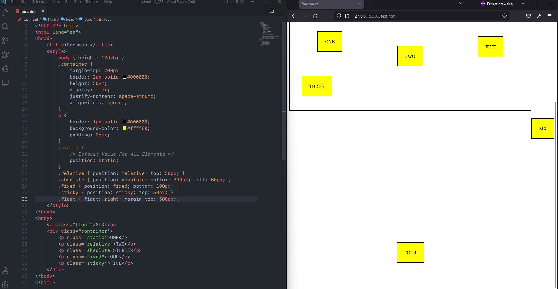
- Normal flow or Static positioning includes block formatting of block-level boxes, inline formatting of inline-level boxes, and relative or sticky positioning of block-level and inline-level boxes.
- For Floats, In the float model, a box is first laid out according to the normal flow, then taken out of the flow and shifted to the left or right as far as possible. Content may flow along the side of a float.
- For Absolute positioning, In the absolute positioning model, a box is removed from the normal flow entirely (it has no impact on later siblings) and assigned a position with respect to a containing block.
- For Fixed Positioning, The element is removed from the normal document flow, and no space is created for the element in the page layout. It is positioned relative to the initial containing block established by the viewport.
- For Sticky positioning, The element is positioned according to the normal flow of the document, and then offset relative to its nearest scrolling ancestor and containing block (nearest block-level ancestor), including table-related elements.
An element is called out of flow if it is floated, absolutely positioned, or is the root element. An element is called in-flow if it is not out-of-flow.
An element is said to be positioned if its 'position' property has a value other than 'static'. Positioned elements generate positioned boxes, laid out according to four properties: top, right, bottom, left.
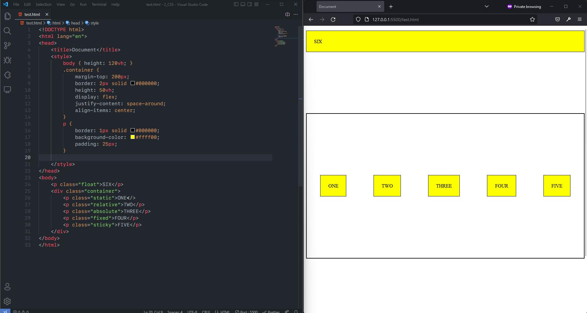
E.g., Code:
<!DOCTYPE html>
<html lang="en">
<head>
    <title>Document</title>
    <style>
        body { height: 120vh; }
        .container {
            margin-top: 200px;
            border: 2px solid #000000;
            height: 50vh;
            display: flex;
            justify-content: space-around;
            align-items: center;
        }
        p {
            border: 1px solid #000000;
            background-color: #ffff00;
            padding: 25px;
        }
        .static {
            /* Default Value For All Elements */
            position: static;
        }
        .relative { position: relative; top: 50px; }
        .absolute { position: absolute; bottom: 300px; left: 50px; }
        .fixed { position: fixed; bottom: 100px; }
        .sticky { position: sticky; top: 50px; }
        .float { float: right; margin-top: 500px;}
    </style>
</head>
<body>
    <p class="float">SIX</p>
    <div class="container">
        <p class="static">ONE</>
        <p class="relative">TWO</p>
        <p class="absolute">THREE</p>
        <p class="fixed">FOUR</p>
        <p class="sticky">FIVE</p>
    </div>
</body>
</html>
Before Applying Positions:
After Applying Positions:
3. Relationships Between Elements in The Document Tree
- Relationships between different html elements of different display such as inline parent element and block child element also show different behaviour and the box model is applied differently to them.
4. External Information
- User agents for continuous media generally offer users a viewport (a window or other viewing area on the screen) through which users consult a document. User agents may change the document's layout when the viewport is resized.
Conclusion
Everything displayed by CSS are boxes but of different sizes and different types. The Box Model is a standard set by the W3C and ratified and supported by all major web browsers. It's one of the core foundation of web.